Sixt ZEN · Brand to design system
One brand, one language — a design system for 12+ products
Case study
2021–23
Web · iOS · Android
Context
Sixt was going fully digital and expanding into the US. Its existing design language, OXIDE, was bold and recognisable, but it was built for a different era.
The goal: one brand and one design system for every customer-facing product.

The problem
Rigid content: layouts couldn't flex to new content and journeys.
Readability issues across screens.
Components that didn't scale across a growing number of products and teams.
Key decisions
Start from the brand, not the components. Vision, personality (energetic, friendly, valuable) and values (inspire, trustworthy, modern) came before any UI.
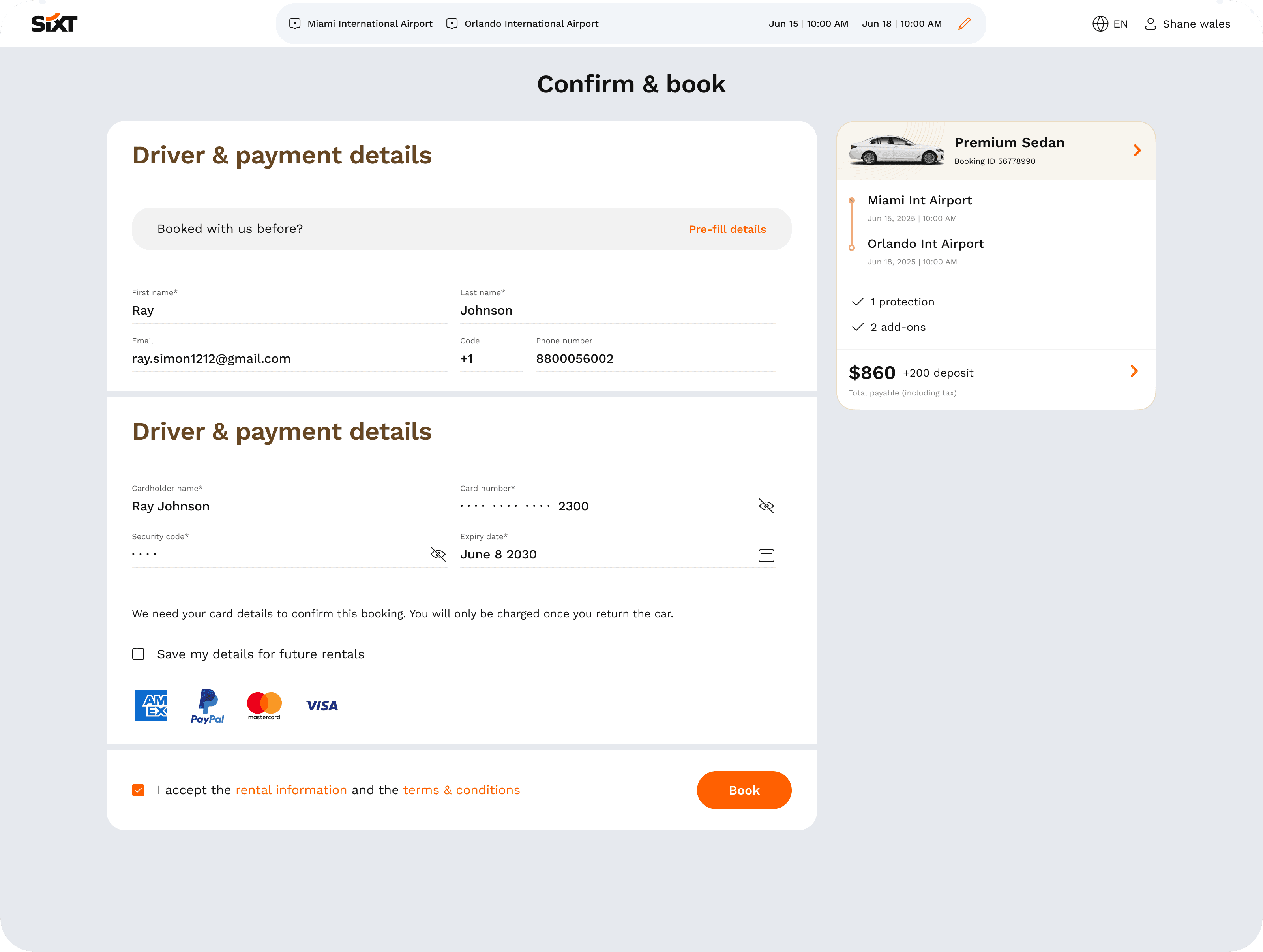
Traditional with modern. Work Sans with EB Garamond, the tangerine orange kept as the anchor, and illustration that turns a rental into travel inspiration.
Atomic and flexible. Atoms → molecules → components → templates, built on three principles: simplicity, consistency, scalability. "More flexible. More humanist."
Built to scale. Multi-brand tokens (SIXT rent, share/ride, SIXT+, partner/franchise), light and dark, and web, iOS and Android from one source. Later extended to the self-service kiosk.
Roles & responsibilities
I led the new brand language and the ZEN design system, and I own Sixt's digital brand guidelines. I worked with product and engineering teams to roll the system out, and ran workshops on brand, typography and how to use the system.
Outcome
12+
customer-facing products onboarded on the system
6+
teams designing and building with ZEN design system
The foundation for SIXT Xpress (−70% waiting time) and the dynamic web presence (+25% click-through)

Brand positioning


New language


Design System


Concept 1 vs concept 2